Meraki Health
Meraki Health is a healthcare organization based in Nepal, focused on providing accessible and innovative medical services to all communities. It emphasizes improving the quality of care through digital solutions, such as telemedicine and health apps, to bridge the gap between patients and healthcare providers. The organization is committed to enhancing patient experiences and making healthcare more efficient and user-friendly in a region where access to medical services can be limited. Meraki Health's mission revolves around using technology to create more equitable healthcare opportunities for all.
-
Dream it.
Meraki Health was looking to revamp its mobile platform to make it more user-friendly and accessible. Meraki stakeholders and the software team wanted to ensure that their platform could be transformed to have a better layout that would not be confusing for its users.
-
Build it.
As a UX Designer for Meraki, I led the redesign of their app to enhance home healthcare accessibility. I, alongside my team, conducted various tests and ideations. Collaborating with stakeholders, I designed an intuitive dashboard for easy service ordering and medical record access, resulting in a streamlined and trustworthy user experience.
Timeline: 3 weeks
-
Grow it.
As we continue to improve the Meraki health app, we have additional ideas to create a more user-friendly experience such as designing an analytics page where patients can view charts and graphs that provide access to their past vitals and track their health data.
User Persona
To better understand our target audience, I developed a user persona named Charlie—a dedicated caregiver who frequently uses a healthcare app to book appointments and services for a relative unfamiliar with technology. While generally satisfied with the app, Charlie finds the current layout and service selection process cluttered and difficult to navigate. Through this persona, I identified key areas for improvement, such as streamlining navigation and incorporating a quick log-in feature like Face ID. These insights guided the design enhancements to ensure the app meets the needs of users like Charlie, who value efficiency and ease of use.
Problem Statement: Charlie needs a healthcare app that is easy to navigate and allows him to seamlessly purchase, view, and track services.
01
HMW improve the experience for a patient/caretaker using the Meraki Health app?
02
HMW make the Meraki Health app a one place stop for patients to access medical records and track their services?
03
HMW use analytics to display a patient’s vitals?
Color Palette


Meraki Health's main color is purple with some navy blue shades so we wanted to keep those in our redesign. We opted for various shades of the vibrant purple Meraki had. We used these shades to either provide borders in some areas or as background for the frames and buttons.

Sketches

In our dashboard here we opted for a search bar feature that allows users to be able to do a quick search if they wanted to lets say find their provider without having to scroll through the entire app to find them. We also decided to put these clickable buttons here like the upcoming appointments, vitals, nursing care, and lab services because they're the primary things that guardians will typically click on.
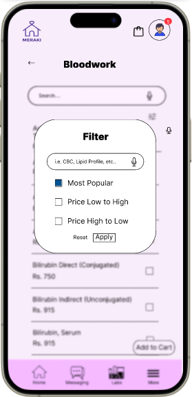
For our nursing care and lab services page we kept that search bar feature and added options to be able to filter through the different options.
We utilized Figma to do a design study and combine all the ideas each designer had
Mid-Fi Wireframes
We included the log in options that was wanted in the main page. It was important for there to be an option to choose which patient profile would be selected.
The bloodwork and nursing care pages are relatively similar. There is an extensive list of bloodwork to choose from so we incorporated a filter option and a search option so that it would be easier to find the needed test.


Usability Testing
Size: 6 users
Tasks: Have users select a nursing package and bloodwork before checking out.
Results: 6 out of 10 users found the text to be very cramped and hard to read. The pie chart on the right represents a sunset orange for 4 out of 10 test users with no errors and mustard yellow for 6 out of 10 test users with errors.
“Important information needs some room”
“The icons are big and easy to understand”
“The text is small and hard to read on certain pages”
High-Fidelity


Design Solutions:
The high-fidelity prototype showcases significant improvements in the app's usability, particularly through a streamlined checkout process and enhanced navigation. We've reorganized the layout to make it more intuitive, reducing the number of steps required to complete a purchase. This includes clearer pathways for users to find services, a more efficient cart management system, and the integration of quick log-in options like face ID. These enhancements aim to provide users with a seamless experience, making it easier for them to book appointments and services for their relatives with minimal effort.
MORE LIKE THIS