REI
REI (Recreational Equipment, Inc.) is a renowned outdoor retail co-op dedicated to inspiring, educating, and outfitting its members and the greater community for a lifetime of outdoor adventure and stewardship. As a co-op, REI places its members at the center of everything it does, returning profits to the community through dividends, discounts, and support for outdoor initiatives.
-
Dream it.
REI was looking to create a mobile platform to help climbers stay more informed on their hobby. REI wanted to be the #1 platform for climbers to stay informed on their hobby every day of the week, whether they were climbing or not.
-
Build it.
As a UX Designer for REI, I spearheaded the design of the mobile climbing app aimed at enhancing the climbing experience for users while also working alongside my fellow designers to research and ideate.
Timeline: 3 weeks
-
Grow it.
Design is never ending, there will always be room to grow. Some next steps are to launch the app on all platforms to gain even more reviews and insights on how to improve usability and accesibility
User Persona
To better understand our target audience, I developed a user persona named Islandia—a tech-savvy millennial who values convenience, transparency, and personalization in rock climbing apps. I identified key pain points, motivations, and behaviors that guided the design process by conducting interviews and analyzing user data. Islandia's persona became the cornerstone for creating intuitive and user-friendly interfaces that resonate with our target audience.
Main Needs


Frustration

Problem Statement: The outgoing climber needs a mobile app to track, plan, and share climbs with friends so that they can feel a part of the community
01
HMW create a social sharing opportunity that allows climbers to connect with friends and share their progress?
02
HMW design a safe and intuitive planning and tracking systems that adapts to climbers goals and preferences?
03
How might we enhance community interaction and foster a sense of belonging among climbers with shared goals?
Color Palette


Our final color palette consists of a serene dark green, pure white, deep black, natural neutral, and a toned red. All of which brings the beauty of the outdoors to life!
Drawing inspiration for the colors from Rei’s shopping website, we decided to craft a sleek design with a modern touch that reflects our love for nature and adventure and evokes excitement in our fellow climbers.
We started by using these calming colors and contemporary styles to create an elevated look and a welcoming space for climbers.
Sketches

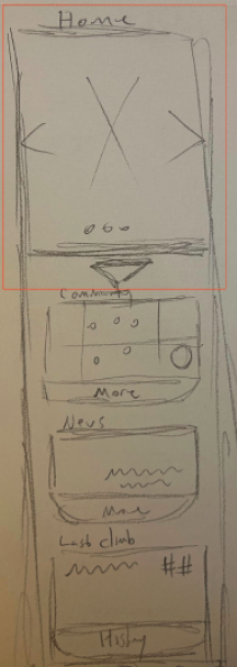
Our goal was to create a deep connection to our community and the great outdoors.
We then began our collaboration, together a team with different perspectives we brainstormed and began to to ideate.
We didn’t just look inwards for ideas, but drew inspiration from various resources such as other apps, user feedback, and nature.
We started sketching ideas on paper and fig jam, which allowed everyone to contribute their ideas to finally create vision what this application should look like.
Mid-Fi Wireframes
We created mid-fidelity wireframes. They acted as the visual blueprints that outlined the app’s layout and functionality based on user feedback! The mid-fidelity wireframes were tested with a select group of users to gather feedback and make necessary adjustments


Usability Testing
Size: 6 users
Tasks: Have people find a climb, start it, share their results, and interact with others in the form of a like on the community page.
Results: 2 out of 6 users did not know where to click next or that they could scroll down, found the colors to be contrasting, and there were too many click paths. The pie chart on the right represents a sunset orange for 4 out of 6 test users with no errors and mustard yellow for 2 out of 6 test users with errors.
“I didn’t realize I could scroll down”
“I want to see more about my climb”
“It feels like a storefront”
High-Fidelity


Design Solutions:
Brand Identity - Refreshed the visual identity with more muted colors, professional typography, and high-quality imagery that reflects the relaxing yet thrilling experience of climbing
Consistency - Ensured a consistent design language across all pages for a cohesive user experience
Mega Menu - Introduced a mega menu to organize products into clear, easy-to-navigate categories
MORE LIKE THIS