The Fire Store
The Fire Store is a leading online retailer specializing in firefighting and emergency response equipment. It offers a comprehensive selection of gear, including fire helmets, turnout gear, boots, gloves, and tools, tailored to the needs of firefighters and first responders. With a focus on quality and reliability, The Fire Store partners with trusted brands to provide essential products that meet the rigorous demands of public safety professionals. The company supports the fire and emergency services community by ensuring access to the best equipment and supplies available.
-
Dream it.
The Fire Store was looking to revamp its existing website platform due to its outdated design and complex navigation. They wanted to ensure that their platform could be transformed to have a better-modernized design.
-
Build it.
I led the entire design process, from initial research to final implementation. I conducted user research to understand our target audience's needs and pain points, then translated these insights into wireframes and high-fidelity prototypes. I designed the user interface, ensuring a visually appealing and intuitive experience.
Timeline: 2 weeks
-
Grow it.
As there is always growth to be done, I have additional ideas to create a more user-friendly experience such as having a personalized recommendation page that would help users find similar products they have purchased before.
User Persona
To better understand our target audience, I developed a user persona named Jake—a dedicated Firefighter who enjoys purchasing firefighting apparel and gear from reputable companies. While generally satisfied with the website, Jake finds the current layout and selection process cluttered and difficult to navigate. Through this persona, I identified key areas for improvement, such as streamlining navigation and incorporating filtering options and a quick pay option for fast checkout. These insights guided the design enhancements to ensure the app meets the needs of users like Jake, who value efficiency and ease of use.
Problem Statement: Jake needs a first-responder e-commerce website that is easy to navigate and allows for seamless purchases.
01
How Might We introduce a quick pay option to expedite the checkout process?
02
How Might We improve the website layout to make it more intuitive?
03
How Might We enhance the selection process by incorporating more effective filtering options to find items faster?
Low-Fidelity Wireframes

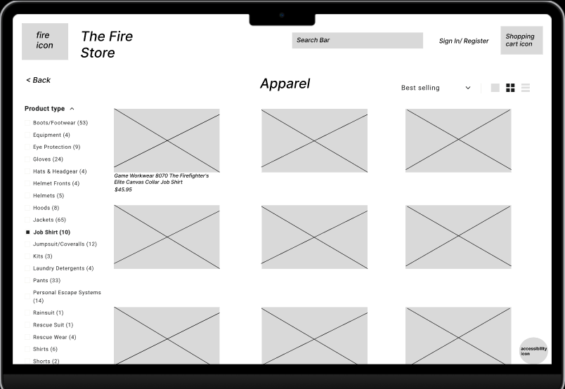
The main focus of the redesign was to address user feedback regarding the home page, which many found overly complicated and confusing to navigate. Users frequently reported difficulty in finding what they were looking for, leading to frustration and a less satisfying experience. In response, we prioritized creating a more intuitive and streamlined layout in the redesign.
If you look at the low-fidelity wireframe, it showcases a modernized and simplified design. Key improvements include the introduction of drop-down categories at the top of the page, which allow users to quickly access different sections of the site without feeling overwhelmed. This new structure is intended to make navigation more straightforward, helping users find what they need more efficiently and enhancing their overall experience on the website.
Mid-Fi Wireframe
In the mid-fidelity wireframe, we enhanced the home page layout and made product discovery easier by adding two filter options. One filter appears on the left side after selecting a category, allowing users to refine their search, while a toggle on the right enables sorting by relevancy, price, and more.
Additionally, we introduced a quick pay option to streamline the checkout process, ensuring users can complete their purchases faster and with minimal effort. These updates are designed to improve navigation, simplify product searches, and create a more efficient shopping experience.

Usability Testing
Size: 15 users
Tasks: Have users navigate to add a work shirt to the cart.
Results: 5 out of 10 users found the text to be very cramped and hard to read. The pie chart on the right represents a sunset orange for 10 out of 15 test users with no errors and mustard yellow for 5 out of 15 test users with errors.
“I couldn’t read what some words said because the font was too small”
“I like the apple pay option on this so quick and easy”
“The ability to filter on here is so good and useful”
High-Fidelity

Design Solutions:
The high-fidelity prototype demonstrates significant upgrades in usability, particularly through a streamlined checkout process and improved navigation. The layout has been redesigned to simplify product searches and enhance the shopping experience. We've introduced two filter options for easier product discovery—one on the left for category-specific filters and another on the right for sorting by relevancy and price. Additionally, a quick pay option has been added to expedite the checkout process, making it faster and more efficient for users like Jake.


MORE LIKE THIS